> "Death by powerpoint"It's a phrase that's become a cliche. But we know what it's like. Long screeds of bullets on a background that's chosen to be _interesting_, in text that's a bit too small to be read from where we're sat near the back.For many years I've tried to find training on how to make PPT-based presentations alive again - whether in work or church. (This isn't the post to get into the discussion about place of sermons; for now it's enough to say that as more preachers are using powerpoint to supplement their words, there's more opportunity to see poor examples of the art.) I first tried to find a course to go on that was more than either a standard presentation course, or a "How to use PPT" course. And failed.
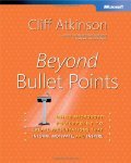
My first real lead was hearing about Cliff Atkinson's book **[Beyond Bullet Points](http://www.amazon.com/exec/obidos/ASIN/0735620520/ref=nosim/librarythin08-20)**. What he said really resonated with what I'd been suspecting - use fewer words, and more pictures. But I wasn't prepared for his major theme: you need to **tell a story** in each presentation, and to do so with some passion. To do this well, borrow from Hollywood: you need a setting, protagonists, an imbalance, the balance, and the solution. Since reading it I've tried to follow his suggestions, though I've had rather few presentations to do recently. Were they better as a result? I think so, though I'm not the best judge. But if nothing else I spent more time preparing them, and more time trying to work out what I felt about the topic, not just the facts of the case, in order to find the story.Mike Workman helped me after a recent sermon by saying that I needed to put "more of myself" and "more passion" into it, which backs up part of this.
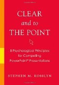
The **[Presentation Zen](http://presentationzen.blogs.com/)** blog has also helped me more recently. Garr posts examples of good and bad presentations he's found, and gives some analysis, plus plugs for good books. The latest one of his recommendations I've started reading is **[Clear and to the Point: 8 Psychological Principles for Compelling Powerpoint Presentations](http://www.librarything.com/work/3793272&book=21861009)**. Its more technical and detailed, and isn't really to do with Powerpoint at all: what he says should apply to any visual medium you're using. There's lots of stuff that's new to me, mostly related to the psychology, such as why a blue background is better for text than a red background. Half is focussed on graphs and other complex graphics, which I guess isn't relevant for most people. Interesting, but my recommendation is for **Beyond Bullet Points** if you can only read one book. But do read [Garr's post summarising the 8 principles](http://www.presentationzen.com/presentationzen/2007/08/i-spent-the-wee.html) as well.

